
CSS Grid and Flexbox: When to Use Each?
Not sure when to use CSS Grid and when to use Flexbox? This article (and video!) can help 😁

On this post
This is a text version of the video “CSS GRID and Flexbox: When to Use Each?” that I published on my YouTube channel.
Worth watching! 😊
In the past
Anyone who worked in Front-end development back then knows how hard it was to do trivial things like a simple vertical alignment.
The same went for building grids, so we went through things like table layouts and columns built with float (with clear: both, of course 😱) until we got to better solutions like Jeet, Lost or even the Bootstrap grids.
But none of them is as simple and complete a solution as CSS Grid.
Sobre grids:
CSS Grid + Flexbox resolvem basicamente todas as dores que tínhamos com relação a grids na Web.
Faz bastante tempo que não uso outras soluções.
O melhor de tudo?
Tem bom suporte até mesmo no IE11. https://t.co/AVZ59QWQCJ
CSS Grid or Flexbox?
This is a very common question.
Both help a lot with alignment (horizontal and vertical) and with building grids in modern applications, but precisely because they can solve similar (or even identical) problems, people end up unsure about when to use one and when to use the other.
The fact is that they can and should be used together!
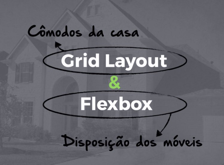
The image above was shared by Diogo Moretti and illustrates the difference between the two really well.
If we imagine a house:
- CSS Grid: Would be responsible for the structure of the rooms
- Flexbox: Would be responsible for the arrangement of the furniture inside those rooms
Dica sobre Flexbox e CSS Grid:
◻️ Flexbox é unidimensional, ou seja, linha OU coluna. Perfeito pra COMPONENTES.
🔳 CSS Grid é multidimensional, ou seja, linhas E colunas. Perfeito pra LAYOUTS.
Então podemos criar componentes com Flexbox e usar dentro de layouts em CSS Grid 😁 pic.twitter.com/0WKHchJZUX
That’s because Flexbox is one-dimensional, meaning row OR column, so it’s perfect for the internal development of COMPONENTS.
CSS Grid, on the other hand, is multidimensional (or two-dimensional), meaning rows AND columns, perfect for LAYOUTS.
In practice
Disclaimer 1: All the code examples are written in Sass Disclaimer 2: The cats in the images are my own cats 😻
Block card
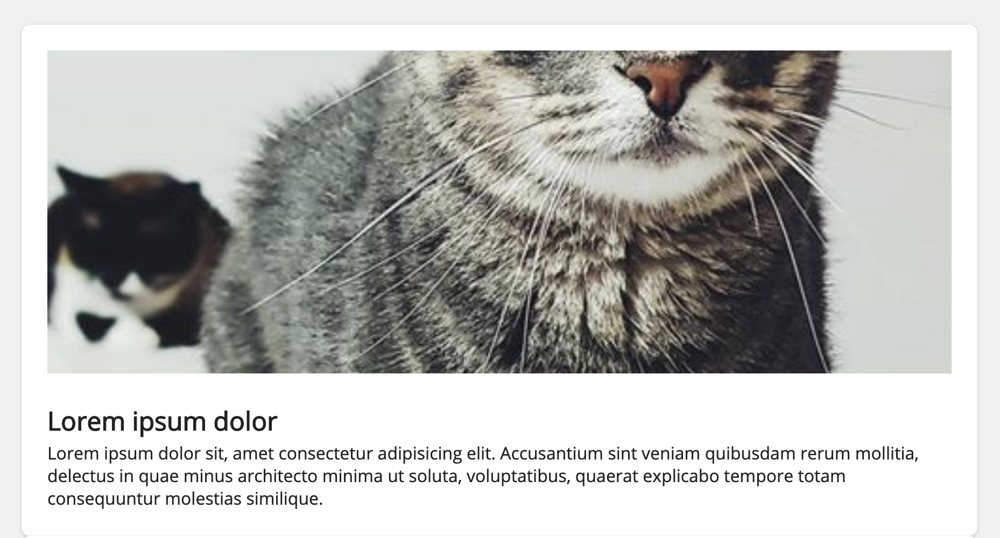
.card {
  background-color: #fff;
  box-shadow: 0 1px 2px 1px rgba(0, 0, 0, 0.1);
  border-radius: 4px;
  padding: 24px;
}
The first thing is that we don’t always need display: flex and display: grid. In cases where we want, for example, a card in block format, meaning one thing below the other, we can simply use display: block.
Keep in mind that many HTML elements, like div, section, article, h1, p, among others, are already block, so many times we don’t even need to explicitly add that to the CSS.
So, to get the result in the image above, the code needed neither display: flex nor display: grid.
Components - Flexbox
Column behavior
But eventually we’ll need to, for example, vertically center a card. That’s where display: flex becomes extremely useful:
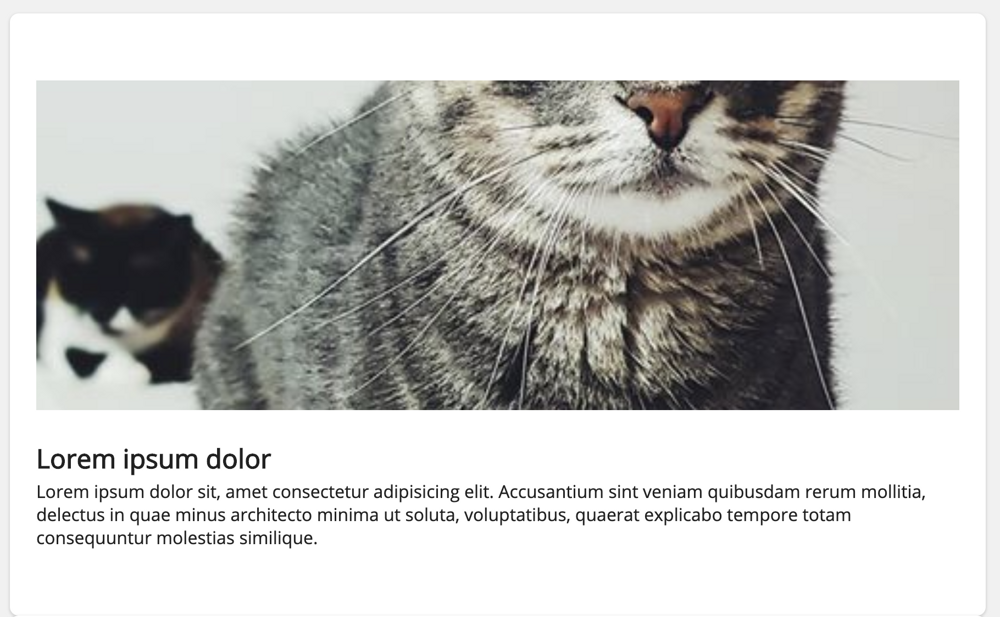
.card {
  background-color: #fff;
  box-shadow: 0 1px 2px 1px rgba(0, 0, 0, 0.1);
  border-radius: 4px;
  display: flex;
  flex-direction: column;
  justify-content: center;
  padding: 24px;
}
Keep in mind that display: flex has flex-direction: row by default, so we don’t need to write that, but when we want to handle things as a column we need to explicitly add flex-direction: column.
The behavior is similar to display: block, but now we can align vertically using justify-content and horizontally using align-items (the axes are flipped compared to flex-direction: row).
Row behavior
If we want the card to behave like a row, just remove flex-direction: column, because as I said before, display: flex has flex-direction: row as the default.
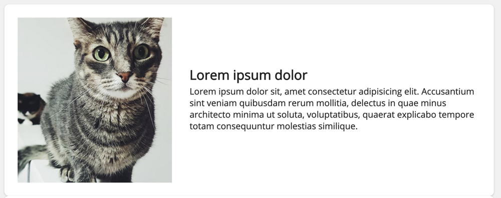
.card {
  align-items: center;
  background-color: #fff;
  box-shadow: 0 1px 2px 1px rgba(0, 0, 0, 0.1);
  border-radius: 4px;
  display: flex;
  padding: 24px;
}
And in this case align-items: center handles the vertical alignment and justify-content the horizontal alignment.
In these examples you can see how simple and quick it is to work with components using Flexbox, we get great results in a really simple way and with few lines of code.
Layouts - CSS Grid
Now that we understand how well Flexbox works with components, I’ll show you how CSS Grid is perfect for layouts!
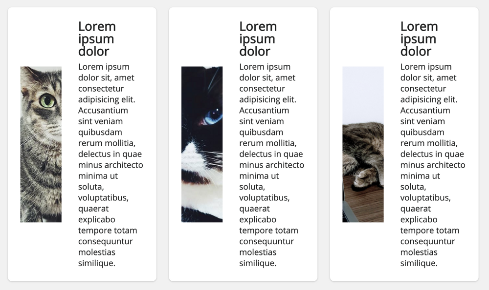
If we want, for example, to place the cards side by side, in three columns, we only need to add a few CSS Grid properties to the parent element.
In this case I created a .grid element that is responsible for organizing the grids, while the card component is responsible for displaying the card.
.grid {
  display: grid;
  grid-column-gap: 24px;
  grid-row-gap: 24px;
  grid-template-columns: repeat(3, 1fr);
}
Using grid-column-gap and grid-row-gap we can add spacing between the child elements (vertical and horizontal!), without touching their code. Awesome, right?
Think about how incredible CSS Grid is for handling the grids in our applications 😍
Worth mentioning that up to this point (08/2020), Flexbox doesn’t have the gap property,
but that’s about to change!.
And believe it! With CSS Grid we can get responsive grids without media queries
I need to show you how awesome this is.
.grid {
  display: grid;
  grid-column-gap: 24px;
  grid-row-gap: 24px;
  grid-template-columns: repeat(auto-fit, minmax(250px, 1fr));
}
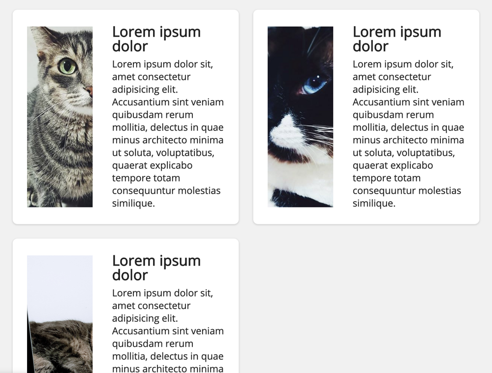
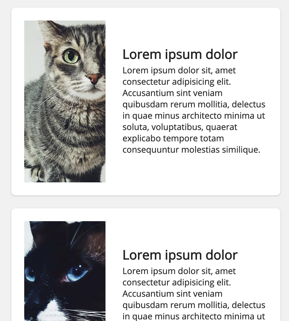
If we want, for example, the grid to have 3 columns on Desktop, 2 columns on Tablets and 1 column on Mobile, according to how many elements fit on the screen, we just add autofit together with minmax.
250px is the minimum column size on the screen and 1fr represents a fraction of the available space in the grid.
In this article
published on CSS Tricks in 2017, you can better understand how the fr unit works and why it’s so widely used with CSS Grid.
It’s worth seeing all these examples working in practice 😜
If you open this example and resize the screen, you can see the grids adapt to the resolution, all of it without a single line of media queries 😁
Support
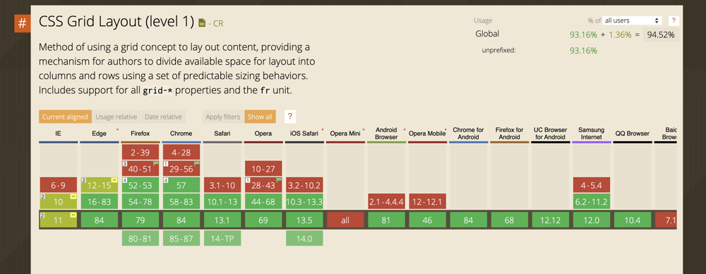
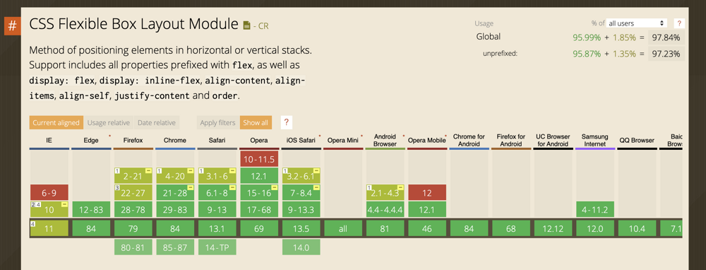
Both CSS Grid and Flexbox have full support in all modern browsers and partial support since IE10!
Conclusion
In recent years CSS has gained a lot of interesting features that make our day-to-day so much easier, and CSS Grid and Flexbox are without a doubt among my favorite properties.
Since they’ve been available for a few years now, we can find thousands of materials that make them easier to learn and use, here are some examples:
I hope you enjoyed the text (and the video, haha) ❤️