
Design System, Venice and the Lego pieces
More about the architecture, development and technologies behind Venice, the Design System at Juntos Somos Mais.

On this post
- Before: JS+ Tech Talks
- JS+ Tech Talk #1: Design System (04/23/2020)
- What a Design System is and what it’s for
- Design System in practice
- Web Components
- Plan B: Multiple Design Systems
- And that’s how Venice was born
- The current stack
- Monorepo
- Lerna and Yarn Workspaces
- Storybook (MDX)
- TypeScript
- Sass, PostCSS and CSS Modules
- CSS Variables
- React and Vue
- Conclusion
This article was originally published on the Juntos Somos Mais Medium, worth following for new posts 😁
I’ve always loved Lego (and the knockoffs from other brands). I must have been about 5 years old when I first got my hands on those blocks, and what impressed me the most was being able to make all kinds of combinations with completely different results, without ever modifying the original pieces.
A primeira experiência que tive com Design System e Componentes foi brincando com LEGO
Before: JS+ Tech Talks
On 04/23/2020 we had the first edition of JS+ Tech Talks, organized by the tech team at Juntos Somos Mais.
I had the honor of giving a talk about the whole concept behind our Design System and the strategies we’re using, and the full content is available in the video below (in Portuguese).
JS+ Tech Talk #1: Design System (04/23/2020)
What a Design System is and what it’s for
In the shortest way possible, a Design System is a set of standards and components that aim to unify design and code. In practice, as Nathan Curtis put it:
It’s a product that should serve other products.
Design Systems need to be living documents, with always up-to-date documentation and components that are modified or created according to the needs of the other teams.
That’s because the focus isn’t the project itself, it doesn’t exist as an end in itself. The goal is to serve a series of other internal (and even external!) products, unifying all the visual and behavioral parts, in things like:
- Color palette
- Spacing
- Typography
- Components
- Etc
Besides standardization, the scalability and resilience of the products also benefit a lot. That’s because components that would be duplicated (both design and code) are created only once, in an agnostic context completely detached from specific business rules. This way the quality of the development tends to improve, and tests are also easier to write.
Since the components won’t need to be built again, the speed of developing new features inside the products also gets a big boost.
Another super relevant benefit is the possibility of gradually replacing legacy code with the components developed in the Design System, all without putting the business evolution of the products at risk.
Good examples of Design Systems are:
It’s an extremely broad subject with many layers of thought.
A good research source to go deeper on this topic is the Design System Repo, which brings thousands of examples of working DSs and lots of articles written over the last few years on the subject.
Design System in practice
I started working at Juntos Somos Mais in February/20. We have projects in React and Vue, using very different technologies between them (Styled Components, Stylus, TypeScript, NextJS…)
One of the challenges I got in my first few days was exactly figuring out how we could standardize our products, both in code and visually.
The idea of creating a Design System came up quickly, but how?
Web Components
Because of the variety of stacks, Web Components was the first thing we thought of, precisely because it’s completely agnostic about technologies and, in theory, can be used with any framework (or none at all).
We ran tests using Svelte and Stencil.
Svelte is a framework only at development time, but it generates good old Vanilla JavaScript after the build. It can be used to create components (JavaScript or Web Components) or entire applications.
Stencil was created by the Ionic Framework team and is meant exclusively for building Web Components, so the whole experience is very focused on that.
Both looked promising, despite the differences between them. In our scenario and for what we needed, Stencil turned out to be the better choice.
However, after some tests, problems showed up, especially in the integration with React, where some adaptations would be needed for it to work as expected.
Especially for more complex components the outlook wasn’t so optimistic, and even though Web Components seemed like an almost natural path, the considerable unpredictability ended up being a deciding factor, since the DS was going to grow and it would be hard to go back yet again.
Plan B: Multiple Design Systems
Tenho trabalhado no Design System da Juntos, usando de stack:
- Monorepo
- Storybook
- React/Vue
- TypeScript
- CSS Modules
A ideia é compartilhar estilos e deixar configurável com Variáveis CSS, facilitando customização, criação de temas, etc.
Tá sendo uma experiência foda 😍
So we went with plan B: different versions for different frameworks.
I didn’t like this idea, especially because of the need to duplicate code (both logic and CSS) and the difficulty we’d have standardizing the visuals and keeping consistency across versions.
But with a bit of planning and architecture, things changed 😜
And that’s how Venice was born
Venice can be a city in Italy (Venezia), a city in Florida, or also a neighborhood in Los Angeles, which is where we drew inspiration to name the Design System.
The project’s code is open and available at the links below.
- Github repository: https://github.com/juntossomosmais/venice
- React version: https://juntossomosmais.github.io/venice/react/
- Vue version: https://juntossomosmais.github.io/venice/vue/
The current stack
This is what the current stack looks like:
- Monorepo
- Lerna
- Yarn Workspaces
- Storybook (MDX)
- TypeScript
- Sass
- PostCSS
- CSS Modules
- CSS Variables
- React
- Vue
Next I’ll talk about each of these choices and why we’re using them.
Monorepo
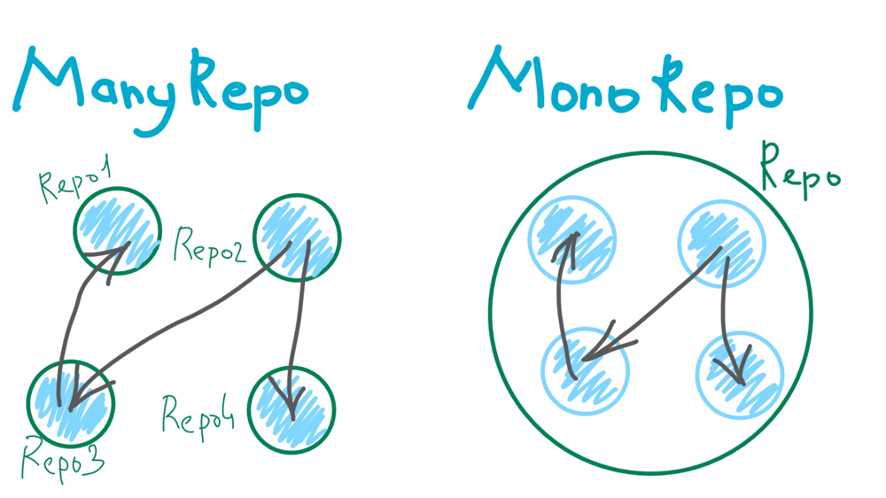 Image credit:
javascript-in-plain-english
Image credit:
javascript-in-plain-english
When a new feature or component is developed in Venice, it has to be available in all the Design System libs (React and Vue). Keeping them in separate repositories would be unfeasible for several reasons, but the main one is:
- Code reuse
Things like documentation, tokens, variables and styles would be exactly the same in both the React and Vue versions, so it made a lot of sense to keep them inside the same repository structure.
Monorepos are here to stay and have been widely adopted, and even though they’re not a silver bullet (nothing is), it fit our scenario like a glove.
Lerna and Yarn Workspaces
Still on the subject of Monorepos, we have an awesome duo: Lerna and Yarn Workspaces.
They work perfectly well together.
Lerna handles versioning and publishing of the packages, and brings a bunch of useful commands for running commands across the shared projects.
Yarn Workspaces adds intelligence and optimizes dependency management, avoiding for example installing node_modules with the same packages over and over inside each project. It also allows cross-installing projects within the Monorepo itself as dependencies, meaning your project inside a Monorepo can be used as a package inside another project.
Below are two very good guides explaining these tools:
Storybook (MDX)

Storybook was chosen to manage the stories inside each Design System, and it’s also responsible for the visual presentation of the components and the documentation.
There are plenty of tools with this purpose nowadays, but we chose Storybook because of its:
- Integration with lots of technologies
- Ability to write in MDX
- Huge plugin offering
- Ease of use
- Solidity
TypeScript
 Image credit:
technotification
Image credit:
technotification
I’ve been using TypeScript for a few years now and I’m in love with it ❤️
But the decision to use TypeScript in this case came from being able to create interfaces that can be shared across all the Design Systems inside Venice, guaranteeing greater integrity in each component’s props.
In other words, it doesn’t matter if we’re using the Vue or the React version of the component, the TypeScript interfaces make sure the names and shapes of each prop are exactly the same.
Absolutely necessary.
As if that weren’t enough, TypeScript is also in charge of transpiling and therefore building the libs, avoiding some silly mistakes in the code that could go unnoticed.
Sass, PostCSS and CSS Modules

Given that we have more than one Design System inside Venice and some (a lot of) things are shared between them, we got to one of the most important questions: Styles.
Duplicating styles could bring inconsistencies to the components, besides making them harder to maintain. So the ideal scenario would be for the components, in React or Vue, to share a single version of those styles.
On top of that, we had another challenge: isolation.
Given these needs, the Sass, PostCSS and CSS Modules combo proved to be extremely effective.
That’s because CSS-in-JS libs like Styled Components, for example, have different versions for React and Vue, while CSS Modules is quite agnostic and adapts well to any technology.
To better understand how CSS has evolved over the last few years and the many options we have today, this article is worth reading:
This way we create just one CSS for each component, and those styles are used in both the Vue and React versions, ensuring visual consistency and avoiding code duplication.
CSS Variables
Another extremely important matter was the variables that need to be shared, not only between the components inside Venice but across all the applications.
Things like:
- Colors
- Spacing
- Typography
These things guarantee visual consistency, so they needed to be scalable and available in a single place.
As I said before, when it comes to CSS the projects use varied stacks: Styled Components, Stylus and Sass. And the only technology common to all of them is CSS itself.
So native CSS variables solved this for us: just import Venice into the projects and they’re available. Besides being dynamic and easy to use, they work in any scenario.
React and Vue
 Image credit:
javascript-in-plain-english
Image credit:
javascript-in-plain-english
Last but not least, the frameworks.
React and Vue were already used in our current projects, so the components would need to work for both.
So whenever a new component is born in Venice, it’s built with working versions for both Vue and React. However, much of the code used to develop the components is written only once and shared between them, like styles, documentation and interfaces.
With specific versions for each framework we can guarantee their stability, and not get any nasty surprises from things breaking because of adaptations.
Conclusion
Design Systems are fundamental when we think about scalable products with consistent interfaces. Big companies are investing heavily in this concept precisely to speed up the launch of new products and also to improve the quality of what gets built.
Maybe some of us got the chance to play with Lego as kids, and back then… having fun without realizing it, we had already learned a lot of the concepts I wrote about in this huge text.
We need to play more ❤️