
From Sass and BEM to CSS-in-JS: the (r)evolution of CSS throughout history 🚀
An article about CSS and how its methodologies evolved over the past few years.

On this post
- People are writing CSS with JavaScript 😱? Yes 🥳
- Starting from the beginning, the evolution of CSS
- But things got better
- CSS experiments
- Preprocessors and postprocessors
- Specificity and style collisions
- Why it’s a problem
- CSS methodologies
- BEM
- But it has its problems
- CSS Modules
- And finally: CSS-in-JS
- Styled Components
- Improving how styles are imported
- Awesome! But I use Angular, now what? 😱
- Styled Components extensions to make the whole damn thing easier 😜
- styled-media-query
- Styled Icons
- Conclusion
People are writing CSS with JavaScript 😱? Yes 🥳
If you’ve never heard of or never used CSS-in-JS, writing CSS inside JavaScript can feel weird. But don’t panic!
In this article I’ll talk a bit about the evolution of CSS and why writing CSS this way can be a good idea nowadays.
Starting from the beginning, the evolution of CSS
CSS was released on December 17, 1996, more than 20 years ago. Its full name is Cascading Style Sheets (CSS) and it’s used to add style to a web document.
There are a few ways to apply CSS:
- Directly on the elements
- Inside the
<style>tag - Linking to a CSS file that contains the styles
Depending on how long you’ve been in the field, you might not know this, but less than 10 years ago, almost no browser supported basic things like:
border-radiusbox-shadowlinear-gradient()opacityrgba
In other words, it was rough!
To add a simple rounded border or shadow to elements, we had to add images with transparency, and in .gif, since IE6 didn’t support .png.
Já temos uma geração inteira de devs que nunca precisaram usar coisas como:
- imagens pra borda arredondada
- DXImageTransformMicrosoft
- filter: alpha(opacity=50)
- clear: both
- getElementById
Tempo ta voando 😱
But things got better
In the last few years there have been huge (r)evolutions in CSS, and not only were basic issues like adding transparency and rounded borders solved, but for quite a while now it’s been possible to use properties and selectors that make day-to-day work so much easier, to name a few examples:
calc()filterdisplay: flexanddisplay: gridposition: stickyvh,vw,vmin,vmax,remand so on:afterand:before:nth-child,:first-child,:last-childand so on:not()
Anyway, the list is huge and it opened up a world of possibilities.
CSS experiments
These new features also made it possible for all kinds of experiments using only CSS to appear. Between 2012 and 2014, we had a large number of drawings and games built without images or JavaScript.
It was a phase of learning and figuring out how to work with the updates that kept coming, so I jumped on the wave too. I’ll mention three experiments I made back then:
- In 2012 I created this Cartman:
-
A little later, around 2013, I drew this piano with gradients.
-
Until in 2014, I wanted to create a Bootstrap-style UI framework without a single line of JavaScript, so I released CSS Components.
All of these things would have been impossible a few years earlier, and that made it possible to build much more mature and scalable interfaces.
Preprocessors and postprocessors
 Image credit: growingwiththeweb
At the beginning of the decade a lot of preprocessors showed up, like:
And a little after that came the concept of postprocessors, like PostCSS and its libs.
It was incredible, because from that moment on it was possible to do things never imagined before with CSS, like nesting elements and creating variables and mixins.
They were decisive for CSS to start gaining more solidity during development and, not only that, they helped plain CSS itself to reinvent itself.
Since then even native variables have been added, in the so-called CSS Module 4, making it possible to create dynamic layouts like the dark mode/light mode of the blog you’re reading right now.
And looking to the future, things like native nesting may show up soon, removing part of the need for preprocessors:
A era dos pré-processadores CSS está oficialmente chegando ao fim. https://t.co/4k1E40x824
Specificity and style collisions
But even with all the evolution of CSS properties and selectors, some problems remained unsolved, like specificity and style collisions.
Why it’s a problem
The more nested and the more specific, the harder it gets to override properties. Using IDs makes this scenario even worse (don’t use IDs, seriously (in Portuguese)).
This also directly impacts performance, nested elements are slower to load, and you can test that in this project.
Style collisions happen when you style a tag without using classes (in Portuguese) or create classes with the same names to style your elements.
This is one of the reasons behind the most famous CSS gif in the world.
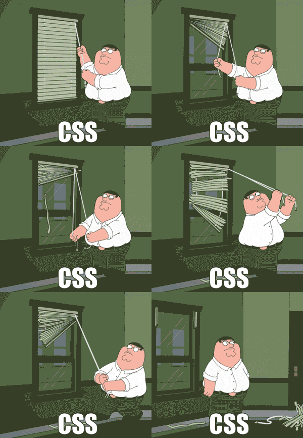
This whole mess also tends to increase the use of !important. And once it’s used, maintenance becomes extremely complex, requiring you to nest more and more (and use another !important) to override things.
(For me the only exception for using !important, and with caution, is to override properties of third-party libs that we don’t have access to).
This whole mess produces code like this:
Que tal analisar esse código CSS, digamos... complicado, e apontar possíveis pontos de melhoria?
Vem comigo nessa thread 😊https://t.co/kwsXqXVPhZ pic.twitter.com/gsdM3GRG7c
And CSS alone doesn’t have mechanisms to prevent this from happening.
CSS methodologies
 Image credit: Gainesville Front-end Developers Meetup
To help with that, a series of CSS methodologies appeared, you’ve probably heard of acronyms like:
- SUITCSS
- DRYCSS
- SMACSS
- OOCSS
- RSCSS
- ITCSS
- BEM
All of them were designed to improve architecture and create standards. They were also developed to avoid specificity and style collisions in the project.
BEM
That alphabet soup mentioned above isn’t mutually exclusive and some of them can be used together, but among all of these, BEM always appealed to me the most.
The premise is simple: Block__Element--Modifiers.
That is, if you’re going to create a menu for your project, it would look something like:
.menu { ... }

.menu__link { ... }

.menu__link--active { ... }
And yes, it works! Since there’s a pattern that has to be followed, the code gets more organized, and since the elements are “scoped” within a block, the risk of collision between classes drops a lot.
On top of that, the idea is to never nest elements, so you wouldn’t write things like:
.header .menu .link { ... }
.header .menu .link.active { ... }
That way your project’s specificity starts to get WELL (BEM, couldn’t resist 😂) more under control.
But it has its problems
Still, it has its problems. After all, everything is manual and you could still, for example, have two .menu classes in the project, which would automatically cause a collision.
On top of that, some classes can get huge and often not very semantic, not to mention that coming up with names for them is a pain (.menu-main-item__link, who hasn’t?).
CSS Modules
Given that scenario, between 2015 and 2016, CSS Modules showed up, which literally gives you the ability to write modules for CSS using a module bundler like Webpack.
That way you can focus on more important things than thinking about class names.
Instead of writing:
.menu__item__link { }You write:
.link { }Generating:
._link_12ie2_1 { }All automatic and with no risk of collision.
If you liked it, you can see an implementation of CSS Modules with Webpack in the Kratos Boilerplate.
Native CSS Modules?
Creating native scopes in CSS has been discussed for some time, but it seems to have gained traction in recent months, with discussions happening in csswg-drafts and in WebComponents.
I believe there are real chances of implementations in that direction happening in the near future.
And finally: CSS-in-JS
 Image credit: ruanyifeng
Taking into account all the context I explained earlier, CSS-in-JS solutions make a lot of sense, because they take advantage of current JavaScript componentization methods to create performant, collision-proof components, with a process that’s extremely automated.
Some of the most popular libs today are:
My only experience so far has been with Styled Components, so the examples will be based on it.
Styled Components
Styled Components was built to improve the way we handle CSS in React application components.
Some advantages:
- Automatic Critical CSS: Components are rendered and automagically inject only their own styles, nothing more. Combined with code splitting, it helps load less code for the end user.
- No class collisions: As we saw earlier, this is one of the biggest problems with CSS, and styled-components provides collision-proof class names.
- CSS removal: Since it works directly in the components, it can easily analyze which code will or won’t be used, including code that’s added after user interaction. That also helps shrink the final code.
- Simple dynamic styling: By adapting styles based on the
propsreceived, you can create dynamic styles easily and intuitively. - Painless maintenance: Everything you need lives in the component’s own context, making it easy to find everything you need for development.
- Automatic vendor prefixing: You write your CSS in the best standard on the market and that’s it, the components take care of providing support for old browsers.
Here’s an example:
import styled from 'styled-components'

export const Main = styled.div`
  align-items: center;
  display: flex;
`
It will automagically generate:
.styled__Main-sc-11b8j8d-1-bSsuBw {
  -webkit-box-align: center;
  -webkit-box-pack: justify;
  align-items: center;
  display: flex;
  justify-content: space-between;
}
You can also pass props to create dynamic styles:
const Button = styled.button`
  background-color: ${props => props.primary ? 'palevioletred' : 'white'};
  color: ${props => props.primary ? 'white' : 'palevioletred'};
`;
render(
  <div>
    <Button>Normal</Button>
    <Button primary>Primary</Button>
  </div>
);
This will generate:
.sc-fzXfMC {
  background-color: white;
  color: tomato;
}

.sc-fzXfMB {
  background-color: tomato;
  color: white;
}
Badass, right?
Improving how styles are imported
The most common approach is to separate the component styles, usually inside a styled.js file, which means you have to import each style individually, something like:
import { Header, HeaderMain, HeaderBrand} from './styled'To make this process easier, considering we’re styling a specific component and all the styles will be used, Willian Justen gave a really cool tip to simplify the import.
import * as S from './styled'

const Header = () => {
  return (
    <S.Header>
      <S.HeaderMain>
        <S.HeaderBrand />
      </S.HeaderMain>
    </S.Header>
  )
}
Handy.
Awesome! But I use Angular, now what? 😱
In that case I have good news and bad news.
The bad news is that Styled Components was created with React in mind (but it works really well in Vue, Svelte and so on), and it’s not recommended for Angular applications.
The good news is that Angular, since version 2, already ships with a pretty complete system for handling CSS and style isolation. This system is called Component Styles and it works really well with any preprocessor (and postprocessor) on the market, and it even works natively with Shadow DOM.
It has two main modes:
- Shadow DOM: Uses Shadow DOM to add styles to the component’s host and then places the component’s view inside it.
- Emulated view encapsulation (default): emulates Shadow DOM behavior by preprocessing (and renaming) the CSS code for the component’s view, similar to the CSS Modules we saw earlier.
Example:
.title {
  font-size: 2rem:
}
Will generate:
.title[_ngcontent-pmm-6] {
  font-size: 2rem:
}
It also implements pseudo-class syntax for Custom Elements, like :host, :host() and :host-context(), which makes a possible export to Web Components easier.
Styled Components extensions to make the whole damn thing easier 😜
Besides the advantages presented earlier, Styled Components also has a series of extensions that make day-to-day work so much easier, and I’ll show you two of them now.
styled-media-query
Writing media queries is a pain, having standards and consistency is even more annoying, so since the days I coded CSS with Stylus, I used Rupture to make the implementation easier. After I adopted Sass, I kept using rupture-sass.
styled-media-query follows the same idea, and makes handling media queries much simpler and more organized.
Just write:
import styled from 'styled-components';
import media from 'styled-media-query';

const Box = styled.div`
  background: black;

  ${media.lessThan("medium")`
    background: red;
  `}

  ${media.between("medium", "large")`
    background: green;
  `}

  ${media.greaterThan("large")`
    background: blue;
  `}
`;
It will generate:
div {
  background: black;

  @media (max-width: 768px) {
    background: red;
  }

  @media (min-width: 768px) and (max-width: 1170px) {
    background: green;
  }

  @media (min-width: 1170px) {
    background: blue;
  }
}
Simple, effective and scalable.
Styled Icons
The days when you had to download icons manually and create sprites using your favorite task runner are gone. Styled Icons makes this experience simple and smooth.
import styled from 'styled-components'
import { Zap } from 'styled-icons/octicons/Zap'

const RedZap = styled(Zap)`
  color: red;
`

const App = () => <RedZap />
And that’s it! Your icon will be available as an SVG, which means you can, for example, easily change the color with a simple fill: gray.
Conclusion
In recent years JavaScript has taken over the responsibility of several layers of Web Development, and it has had a positive impact on how we build things, including the way we work with CSS (Stylus, PostCSS, etc.). That said, using JavaScript to automate more and more processes we used to do manually ends up being natural.
Things change fast in the Front-end world, every now and then something new comes along that changes how we deal with the technologies on the market, but it’s always worth learning new concepts at each stage of these changes. If you haven’t used CSS-in-JS yet, it’s worth testing and trying to implement it in your stack.
Cheers 🥳