
From Zero to Front-End Hero (Part I)
A complete guide to learning Front-End development

On this post
- HTML and CSS basics
- Practicing basic HTML and CSS
- Experiment 1
- Experiment 2
- HTML and CSS best practices
- Semantic markup
- CSS naming conventions
- CSS Reset
- Cross Browser Support
- CSS Preprocessors and CSS Postprocessors
- Grid Systems and Responsiveness
- Practicing HTML and CSS best practices
- Experiment 3
- Experiment 4
- Stay up to date
- Learn by example
- Styleguides
- Code conventions
- Final thoughts
- About this article
I remember when I started learning Front-End development. I found so many articles and was so overwhelmed by the amount of material I would need to learn that I didn’t even know where to start.
This guide will help you navigate learning Front-End development. It gives you learning resources that I’ve found effective in the past, along with some extra explanations.
To keep this guide digestible, I split it into two parts. The first part covers building interfaces with HTML and CSS. The second part covers JavaScript, frameworks, and design patterns. If you’re already familiar with HTML and CSS, you can skip to the second part, which covers all things JavaScript.
HTML and CSS basics
In Front-End development, everything starts with HTML and CSS. They control the things you see on a website. HTML is for content, while CSS handles style and layout.
To get started, read the HTML and CSS tutorials from the Mozilla Developer Network (MDN). MDN gives step-by-step explanations of the most important HTML and CSS concepts. On top of that, each chapter has a page with interactive demos on CodePen and JSFiddle.
After finishing those tutorials, check out the CodeAcademy course: Make a Website. It only takes a few hours to complete and it’s a great start for building websites with HTML and CSS. If you want more, Building web forms is another CodeAcademy tutorial that walks you through styling a web form.
To practice CSS, try CSS Diner, a fun CSS challenge. Another important aspect of HTML and CSS is layouts, and LearnLayout is an interactive tutorial that shows you how to build layouts using HTML and CSS.
Also learn how to use Google Fonts with CSSTricks’ Basics of Google Font API. Typography is fundamental to building your interfaces. When you have time, I strongly recommend reading the free online book Professional Web Typography by Donny Truong. It’ll teach you everything you need to know about typography in Front-End development.
Throughout this process, don’t worry too much about memorizing things. Instead, focus on learning how HTML and CSS work together.
Practicing basic HTML and CSS
Now that you have a basic understanding of HTML and CSS, let’s have some fun. In this section there are two experiments to give you practice building sites and interfaces. I use the term “experiments” because in experiments you learn the most, from both failure and success.
Experiment 1
In our first experiment, we’re going to use CodePen. CodePen is a Front-End development playground where you can code HTML and CSS without saving files locally, and it also has a live preview that updates as soon as you save your code.
Using CodePen, you kill two birds with one stone. On one side you practice HTML and CSS, on the other you build a basic portfolio. We’ll also use Dribbble, which is full of design inspiration.
Go to Dribbble and look for a design that’s simple enough for you to code in a few hours. I picked out a few designs for you to start with: 1, 2, 3, 4 and 5. I chose mobile-first designs because they’re less complex than their desktop versions. However, feel free to pick the desktop version too.

After you’ve picked a design, go ahead and try coding it on CodePen. If you get stuck, remember that StackOverflow is your friend. Another useful practice is going to sites like Medium, AirBnB and Dropbox and using your browser’s inspect tool to see how they achieve different layouts and styles. Also take a look at some pens on CodePen. I found some cool references:
If your version comes out different from the original, don’t get discouraged. Keep practicing with different layouts and you’ll notice improvements with every attempt.
If you don’t have a designer background, chances are your designer’s eye is underdeveloped. A Front-End developer with a good eye for design will be able to spot good projects and replicate them perfectly. A few weeks ago I wrote an article about how to develop your eye for design.
Experiment 2
I hope the first experiment gave you some confidence writing HTML and CSS. For experiment 2, we’ll look at a few websites and then code some of their components.
Some websites use CSS frameworks or obfuscate their CSS classes, making the source code hard for you to read. That’s why I picked some well-designed sites with easy-to-read source code.
- Dropbox for Business: Try to replicate the hero section
- AirBnB: Try to replicate the footer
- PayPal: Try to replicate the navigation
- Invision: Try to replicate the sign-up section at the bottom of the page
- Stripe: Try to replicate the payments section
Once again, the focus of experiment 2 is not to recreate the whole page. Although that certainly wouldn’t hurt! Pick a few key components like the navigation or a hero section to code. I gave suggestions next to the list of sites, but feel free to pick other components.
You can code this experiment on CodePen or store it locally. If you choose to store it locally, you can download this sample project as a boilerplate or create the files from scratch. I suggest using editors like Atom or Sublime.
Also, keep in mind that for any site, you can always see its HTML and CSS. Just right-click the page or a component, click inspect, and a panel will show up with the HTML on the left and the CSS on the right. Once you’re done, or if you get stuck, use the Inspector to see how you’re doing and compare your HTML and CSS.
HTML and CSS best practices
So far, what you’ve been learning are the basic principles of HTML and CSS. The next step is to learn best practices. Best practices are an informal set of rules that improve the quality of your code.
Semantic markup
One of the best practices for HTML and CSS is writing semantic markup. Good web semantics means using the appropriate HTML tags and meaningful class names to convey structural meaning.
For example, the h1 tag tells us the text is an important title. Another example is the footer tag , which tells us the element belongs at the bottom of the page. To learn more, read A Look Into Proper HTML5 Semantics and What Makes For a Semantic Class Name from CSSTricks.
CSS naming conventions
The next good practice for CSS is coming up with proper naming. Good naming, just like semantic markup, conveys meaning and helps make our code predictable. You can read about the different naming conventions in the article OOCSS, ACSS, BEM, SMACSS: what are they? What should I use?.
In general, I suggest experimenting with simple naming conventions that make intuitive sense to you. Over time, you’ll figure out what works best. To see how companies like Medium use naming conventions like BEM, read Medium’s CSS is actually pretty f***ing good. In that article, you’ll also learn that arriving at an effective set of CSS conventions is an iterative process.
CSS Reset
Browsers have small style inconsistencies, from margins to line-heights. For that reason, always use a CSS Reset. MeyerWeb is a popular solution. If you want to go deeper, you can read Create Your Own Simple Reset.css File.
Cross Browser Support
Cross Browser support means your code works in most up-to-date browsers. Some CSS properties, like transitions, need
vendor prefixes to work properly in different browsers. You can read more about vendor prefixes in the article CSS Vendor Prefixes. The main thing is that you should test your site in multiple browsers, including Chrome, Firefox and Safari.

CSS Preprocessors and CSS Postprocessors
CSS has come a long way since its beginning in the 1990s. As user interface systems became more and more complex, people developed tools known as preprocessors and postprocessors to manage the complexity.
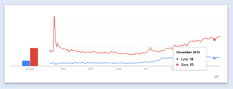
CSS preprocessors are extensions of the CSS language that add new features like variables, mixins and inheritance. Right now the two main preprocessors are Sass and Less. In 2016, Sass is generally the more widely used one. Bootstrap, the popular responsive CSS framework, is switching from Less to Sass too. Also, when most people talk about Sass, they’re actually talking about SCSS.
CSS postprocessors apply changes to the CSS after it has been written or compiled with a preprocessor. For example, some postprocessors like PostCSS have plugins that add vendor prefixes for browsers automatically.
When you first discover preprocessors and postprocessors, it’s tempting to use them everywhere. However, start simple and add extensions like variables and mixins only when needed. The article I suggested earlier, Medium’s CSS is actually pretty f***ing good, also covers how much is too much when it comes to preprocessors.
Grid Systems and Responsiveness
Grid systems are CSS structures that let you align elements horizontally and vertically.
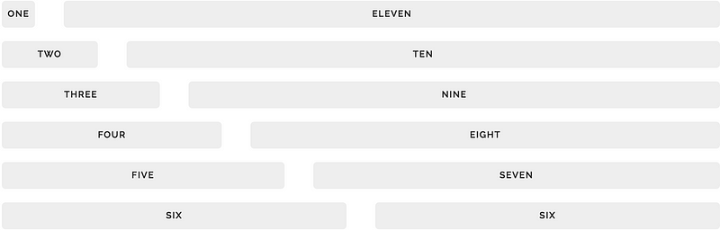
Grid frameworks like Bootstrap, Skeleton and Foundation provide stylesheets that manage rows and columns in layouts. While grid systems are useful, it’s also important to understand how they work. Understanding CSS Grid Systems and Don’t Overthink Grids are great summaries.
One of the main purposes of grid systems is adding responsiveness to your site. Responsiveness means your site resizes according to the window width. The result is often achieved through CSS media queries, CSS rules that only apply at certain screen widths.
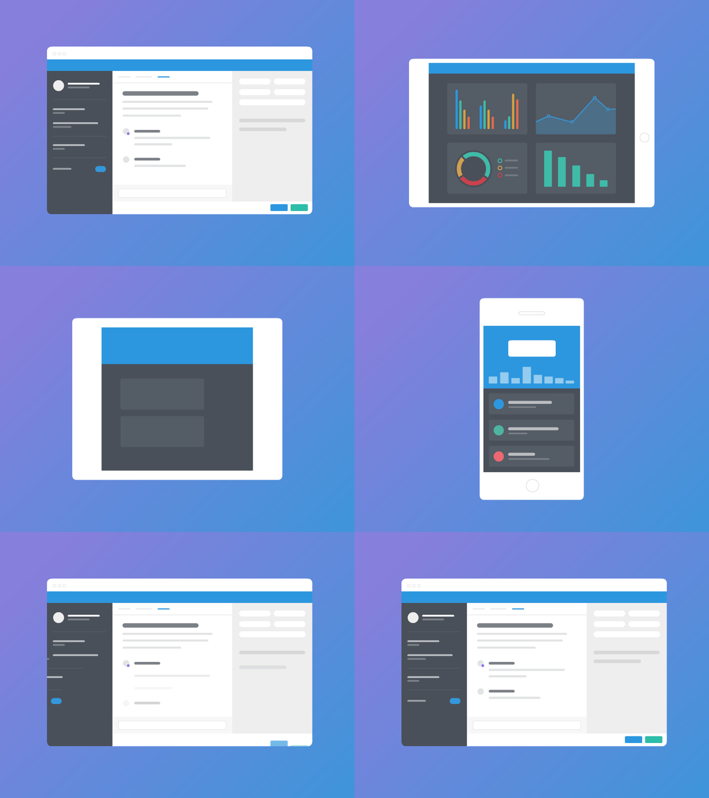
You can read more about media queries in Intro to Media Queries. And since we’ve entered the mobile-first era, also read An Introduction to Mobile-First Media Queries.
Practicing HTML and CSS best practices
Now that you’re armed with best practices, let’s put them to the test in battle. The goal of the next two experiments is to practice writing clean code and to observe the long-term effect of good practices on readability and maintainability.
Experiment 3
For experiment 3, pick one of the previous experiments and refactor your code using the best practices you’ve learned. Refactoring means editing your code so it’s easier to read and less complex.
Being able to refactor code effectively is an important skill for a Front-End developer. Creating quality code is an iterative process. CSS Architectures: Refactor Your CSS is a good starting point for refactoring your code.
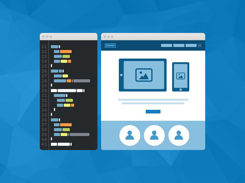
Here are some things to ask yourself while you’re refactoring your code.
- Are your class names ambiguous? Six months from now, will you still be able to understand what the class name means?
- Are your HTML and CSS semantic? When you look at your code, can you quickly tell its structural and relational meaning?
- Are you using the same hexadecimal color code more than once in your code? Would it make more sense to refactor it into a Sass variable?
- Does your work run as well in Safari as it does in Chrome?
- Could you replace your layout code with a grid system like Skeleton?
- Are you using
!importantoften? How can you fix that?
Experiment 4
The last experiment will use everything you’ve learned about best practices. However, the results of using best practices often aren’t apparent until you use them on a larger project.
For the last experiment, you’re going to build your own portfolio. As a Front-End developer, your portfolio is one of your most important digital assets. A portfolio is a site where you show your work. More importantly, it’s a record that helps you keep track of your progress and development. So even if you only have 1 or 2 things to show, show them.

To get started, follow along with Adham Dannaway’s article My (Simple) Workflow To Design And Develop A Portfolio Website.
If your first portfolio doesn’t turn out perfect, that’s fine. Portfolios go through many changes. And what matters is that you built it with your own skills.
Stay up to date
Since HTML and CSS won’t go out of style anytime soon, it’s important to stay up to date with the Front-End market.

Below is a list of sites, blogs and forums that are both enjoyable to read and informative.
Learn by example
Finally, the best way to learn is by example. Here’s a set of styleguides and code conventions that will teach you how to be a more effective Front-End developer.
Styleguides
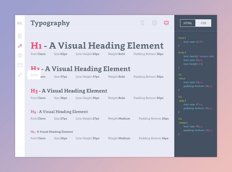
Styleguides are collections of CSS components and patterns that can be reused across your site. The main thing to notice in these styleguides is how HTML and CSS based components can be reused to keep your code DRY.
Code conventions
Code conventions are designed to keep your code readable and easy to maintain. Some of these links, like CSS Guidelines, are guidelines for writing better HTML and CSS, while others, like Github internal CSS toolkit and guidelines, are examples of quality code.
Final thoughts
Hopefully, by the end of this article you’re familiar with HTML and CSS and have a few projects in development. The best way to learn Front-End development is by building projects and experimenting. Remember, every Front-End developer had to start somewhere. It’s better to start now than tomorrow!
About this article
This text is a loose translation of the fantastic article From Zero to Front-end Hero (Part 1) published on Medium by @jonathanzwhite.
So I want to thank him, first for writing this great text, and second for allowing me to make this translation.
It’s worth pointing out that the translation isn’t literal, I adapted some parts to make it easier to understand. If you find any serious translation errors, you can open a pull request with the fix or an issue telling me where the error is.